
Redesign of a Social Cataloging App - Goodreads

OVERVIEW
I've used this app for years, and initially, I found it frustrating without pinpointing why. With my technical and design expertise, I now understand the app's shortcomings better and can address them effectively.
Role
UX Research
UX Design Prototyping
Team
Individual
Tools
Figma
Procreate
Timeline
4 weeks
PROBLEM
How might we improve the readers' experience by modifying or adding new features in the app?
FINAL DESIGN
In response to the user's review and leveraging my design and development experience, I've visually updated and suggested technical improvements for the app.


PROCESS
Okay, but how did I actually get there?
RESEARCH
In addition to my own firsthand experience, I've begun exploring user reviews of Goodreads on both the App Store and Apple Store.

DESIGN OPPORTUNITIES
How could I translate these pain points into design opportunities?
SCOPING DOWN THE PROBLEM
Website's design in need of a modern update
Personalize the search option based on user’s data
Inefficient User Interface.
Stringent Rating Standards
Limited updates from their friends
#OPPORTUNITY 1
How might we improve the website’s design and user interface?
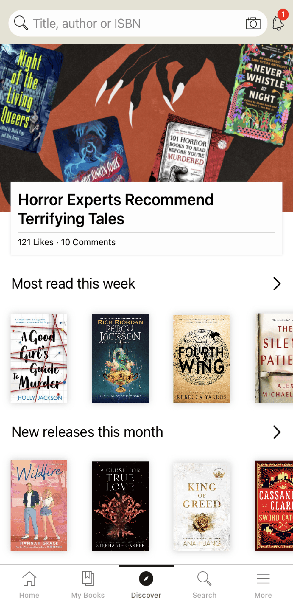
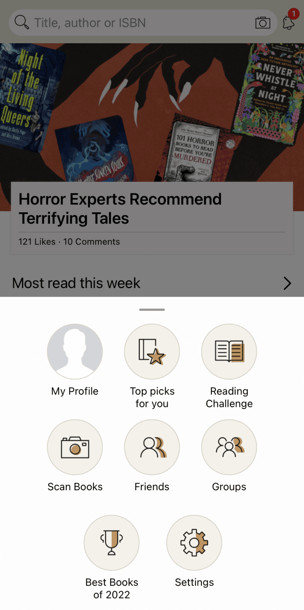
Restructured the home screen to minimize clicks and overhauled the app's aesthetics.
The home and discover pages have been merged into the main page. To streamline the user experience and minimize clicks, I've integrated the options from the "more" section into the home page.
Home page
Discover page
More option

Revamped the layout of the "My Books" section and eliminated unnecessary features.
I've simplified the process by introducing a toggle button in the 'Create a new shelf' pop-up. This allows users to directly add a book to their primary shelf, reducing the need to navigate through "more shelves" and select from various options, resulting in fewer clicks.


#OPPORTUNITY 2
What can be done to improve the search bar and stringent rating?
Improving the search function.
Drawing from my development background, we can enhanced the search function's effectiveness by storing user data, including clicks, search history, preferred genres, friend recommendations, and trending books. As a result, the search algorithm prioritizes these factors, offering more personalized book suggestions.


Reducing the stringent rating.
Goodreads leans heavily towards critical reviews and ratings, which I found interesting. People seem to focus more on what they didn't like about a book rather than what they enjoyed. This critical trend might stem from various reasons like wanting to appear discerning or the desire to stand out in discussions.
In Goodreads, there's no provision for awarding a 0.5-star rating, and it can be quite vexing when deciding between 4-star and 5-star rating for a book.
Sometimes we can acknowledge “a book is well-written and you still hate it”
The desire to provide honest feedback leads to critical reviews.
Considering the factors mentioned above, I've devised two solutions that are not design-related but aimed at enhancing the Goodreads community.
Introducing a 0.5-star rating option, instead of being limited to whole numbers, would not only contribute to a more accurate average rating but also allow users to provide more precise and fitting ratings.
Including the feature of private reviews, visible only to your friends, would ensure that they don't impact the book's overall rating. This feature becomes valuable, especially in cases where you can recognize a book's quality even if it wasn't to your personal liking.
#OPPORTUNITY 3
What are the ways I can make users spend more time on it than just using it to read reviews and comments?
Added a new feature where the user can join an existing book club or create their own that other readers can join
If none of the book clubs interest a user, they can choose a recommended book and create their own book club! In just a few steps, users can create their own club and share it to social media to spread the word (The app will also notify users of the newly created book club)

REFLECTION
FINAL THOUGHTS
Whenever I use Goodreads, I always lose interest. My tweaks were an attempt to make the app a more engaging experience and see if I could make visually pleasing yet pragmatic interfaces. However, my design process was conducted without access to Goodread’s internal research or design strategy and I'm sure there are parts of the current interface that are specifically designed to meet certain internal metrics.
WHAT I LEARNED?
I began this redesign project with the intention of conducting it within a limited time frame, essentially as a "sprint." Given the time constraints, I found it necessary to rely on the product's original visual style to some extent, rather than getting deeply involved in creating entirely new design elements or motifs. Instead, my primary emphasis was on restructuring the product, not a complete overhaul.
WHAT’S NEXT?
I was aware that there would be further aspects to address if I decided to proceed with this project. In this case study, my redesign efforts primarily focused on revamping the layout and enhancing the user interface. I anticipate that delving deeper into bridging the gap between the website and the app, especially considering the numerous missing features in the app, would present fresh challenges and lead to new insights into the product.
Other works
Exit


L2
L1


49 seconds Elevation


Nirvana Chamber
Impermanent Mudra Sculptures
Experience The Path of Suffering
Entrance
Let’s chat
Always happy to connect, brainstorm, or dive into
something creative together.
This website is best viewed on desktop
Madhumitha Manimaran © 2023.
