

Redesign focusing on information architecture and Heuristic evaluation

OVERVIEW
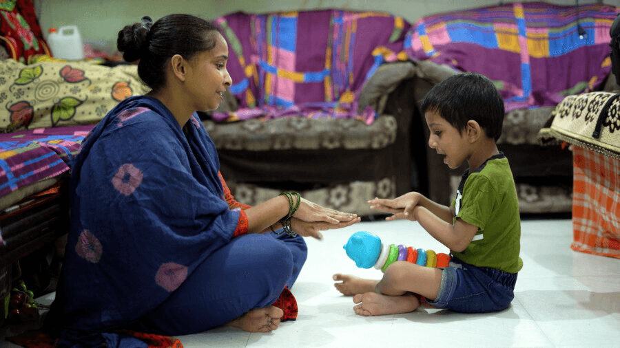
Some Context about the organization
PrathamUSA is a US-based(as the name says lol) volunteer-driven organization focusing on improving education and literacy for children and young women in India.
The key users of the PrathamUSA: Beneficiaries, Volunteers, Donors&Sponsors, and General Pubic.
Role
Content Audit
UX Research
Prototyping
UX Design
Team
Individual
Tools
Figma
Axure
Miro
Timeline
10 weeks
GOAL
The main goal is to identify underperforming content and opportunities to improve search engine rankings through better keywords and metadata.
THE PROBLEM
Based on the research
PrathamUSA has the required content
but it is scattered & confusing and doesn't meet the target audience's needs.
BUT WHY IS IT IMPORTANT TO SOLVE?
PrathamUSA’s goal is to improve literacy skills for millions of children.
To support this, providing a strong user experience is essential for retaining donors and volunteers, while encouraging their ongoing involvement through donations or active participation.
RESULT
Pages reduced from 600 to 400. Steps in user flows reduced from 10 steps to 6.
PROCESS
How did I solve the problem?
STRATEGYZING
I first analyzed PrathamUSA’s user needs and business goals
User needs
I want to see real stories of the NGO's impact to build trust and confidence.
If I want to participate, I need clear, easy steps to get involved.
When donating, I need a simple, secure process with multiple payment options.
I want to understand the NGO’s mission and programs to feel motivated to engage.
and then dug into
business goals
Clear understanding of the mission and programs to align and engage effectively.
Building a strong, recognizable brand presence is essential for long-term success.
Fostering community among supporters, & stakeholders is key.
It helped me reduce the guesswork & provided clear direction
Thus I aligned the content and identified the primary tasks, keeping both business goals and user priorities in mind.
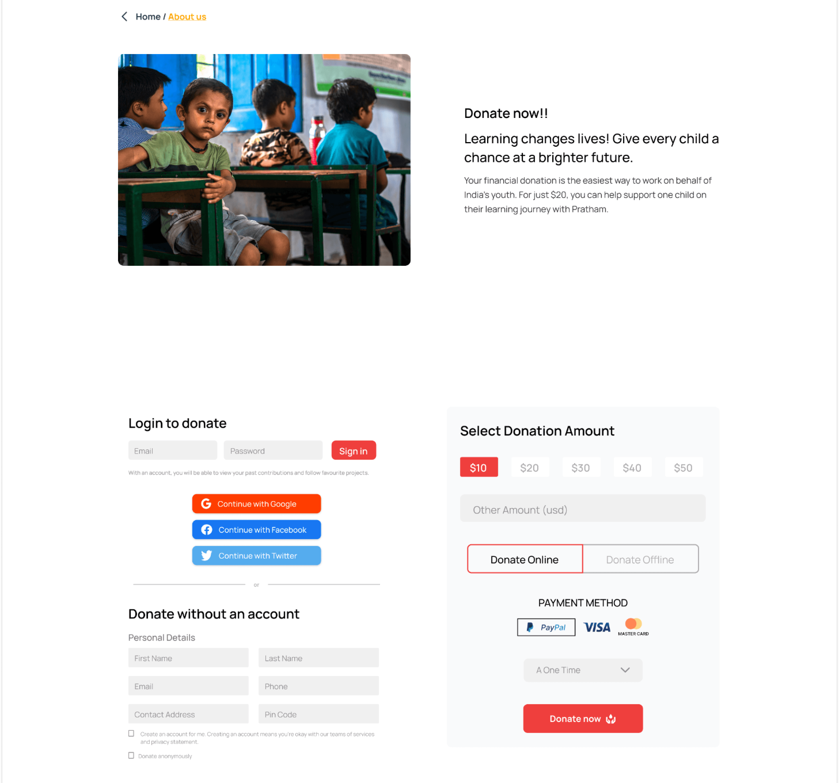
Start a donation
Users can choose from donations like one-time, recurring, matching gifts from your company, and IRA.
Participate in
an Event
Make the users attend the events that further help them to donate or get involved in Pratham’s activities.
Volunteer
The users volunteer by participating in a series of options; some are day-long while others are longer commitments.
Read Stories
of Impact
Make the users learn and explore how Pratham has positively changed lives through real stories.
RESEARCH
To understanding the users more I conducted 3 semi structured task based interviews
Then I created personas (I know creating personas is a controversial subject whether it’s needed or not) not going there - it helped me develop a deeper understanding of who I am designing for while redesigning it.

Anna
Undergrad Student
Anna likes to volunteer in her free time but
Pain Points
Frustrated with complex and outdated UI.
Confused about the lack of information about how her skills can be best utilized.

Josh
Financial Analyst
Josh’s passionate about community service and want to donate but
Pain Points
Has a hard time finding the right one as he wants to invest in a genuine firm.
Frustrated by the lack of follow-up or acknowledgment after making donations.

Mal
Social Manager
She’s interested in partnerships to boost charitable contributions but
Pain Points
Concerned about the transparency of donation use.
Skeptical about organizations that don’t provide clear impact data.
Some of the key pain points I considered from persona and interview
Navigation Challenge
Transparency Concerns
Usability Issues
Lack of Clarity
FIXING USABILITY ISSUES
A heuristic evaluation revealed that there were several basic usability issues thus making it difficult for users to orient in different parts of the website.

Improving Navigability and Clarity
Using descriptive, action-oriented link labels and clear CTA placement improves navigability and content discoverability. Restructuring the content enhances information hierarchy, making it easier for users to understand at a glance.

Optimizing User Orientation
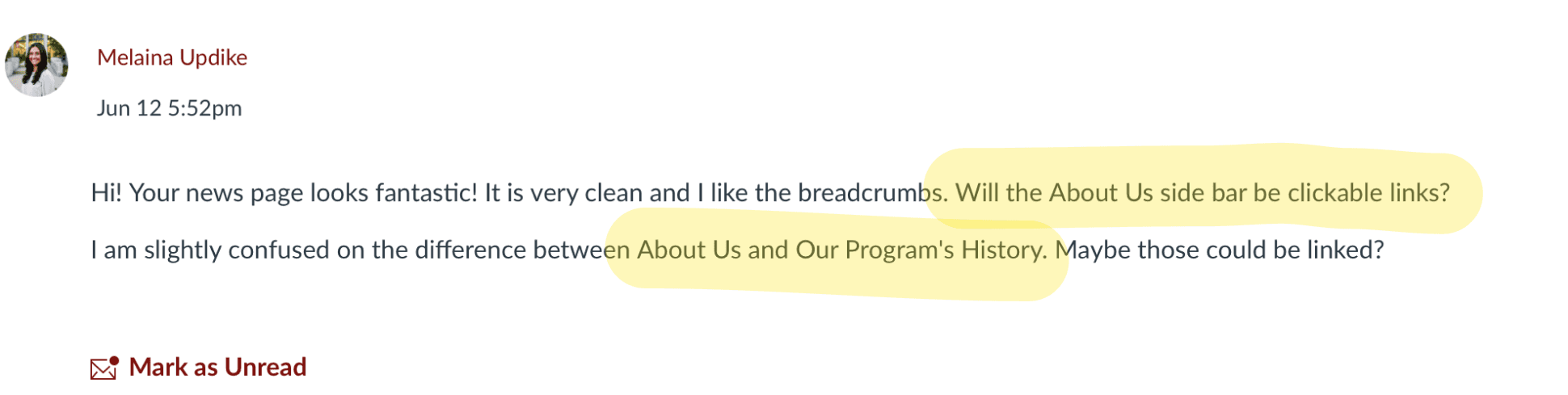
Adding metadata, breadcrumbs, and filters and fixing deep-tier navigation will improve user orientation, content retrievability, and way-finding, making it easier for users to backtrack and find content intuitively.
ENHANCING USER EXPERIENCE
Taking a comprehensive approach to redesign
Having a cohesive strategy helped me avoid going on a case-by-case basis. This ensured a result that improved, including creating simpler navigation, modular page types, and clearer content.
Task-Based Navigation
Organize information based on user goals or tasks to to provide relevant content quickly.
Taxonomy Development
To categorizes information into clear, non-overlapping groups, improving content findability.
Content Grouping
Group content together to facilitate easier access and navigation for users looking for specific information.
Strategy - 1
Considering the size of the website, I classified into keep/delete/combine and relevance(low/medium/high).
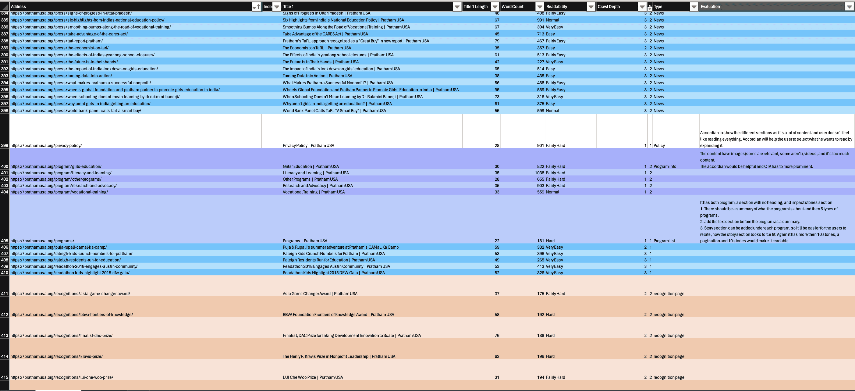
It helped me minimize the number of pages on the website by identifying redundant pages and removing outdated or irrelevant content, resulting in a more streamlined user experience.
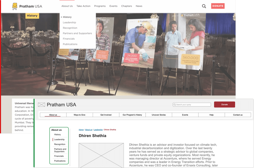
link to my content audit file
Strategy - 2 & 3
Then I did what a designer would do I started revamping the existing site map.

BEFORE

To prioritize donation as a primary task for the website, the navigation bar has been restructured to make it easier for the user to access.
To address volunteering as a secondary action, I created a common actionable term to encompass all volunteering activities.
Combined the news and chapter stories sections into one, using a unified actionable name.
VERSION 1
FINAL VERSION

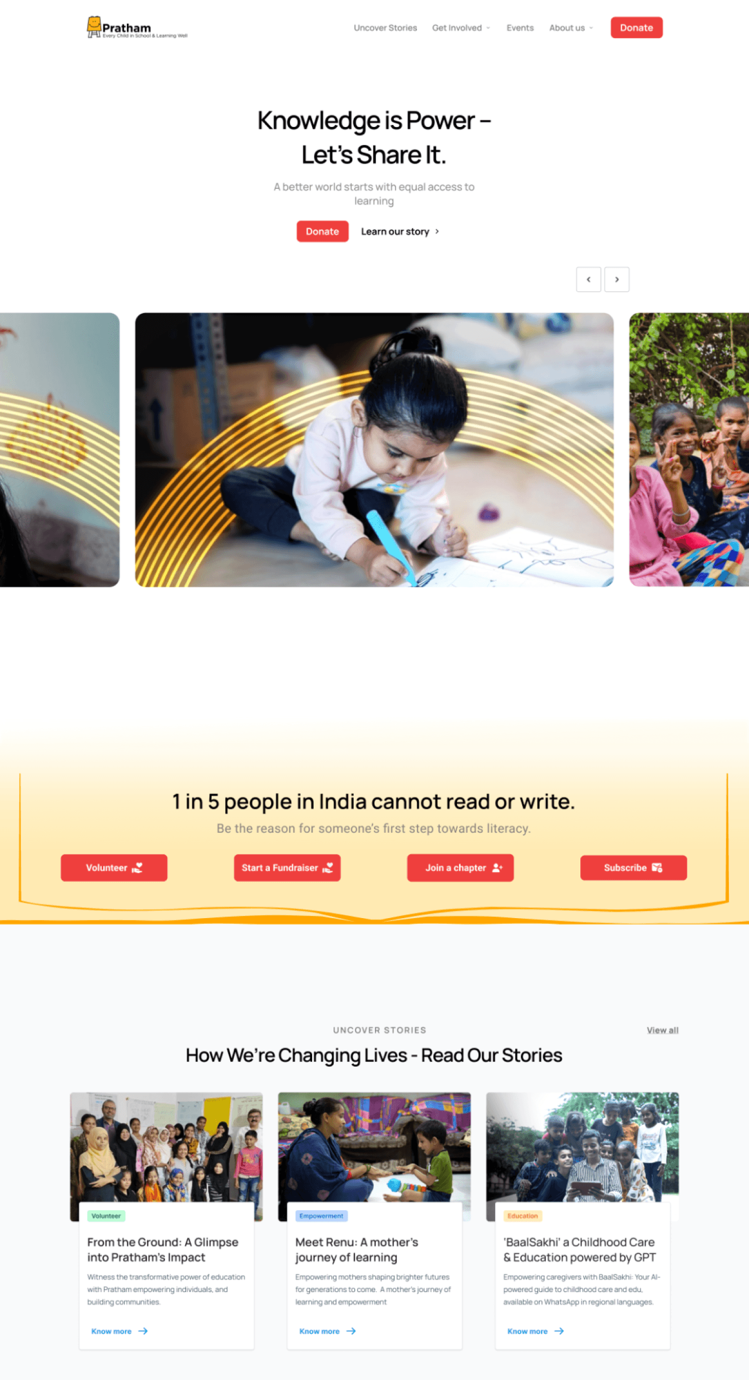
Uncover Stories
Get Involved
Events
About us
Donate
The focus was to help search engines better crawl and make it easy for users to find the information they need by replacing the labels with actionable words and arranging it based on tasks.
A closer look into other smaller design decisions

Rewriting the content
The content was made easily scannable and digestible while highlighting the important information. An accordion was also introduced to reduce the scrolling and not overwhelm the users with a lot of information rather than expand on fields they’re interested in.
Highlighting important content
I reduced the clutter on each informational page to make it more relevant to the user's needs and introduced different headings and titles to ensure that important information was not lost in the rest of the text.
1 in 5 people in India cannot read or write.
Be the reason for someone’s first step towards literacy.
Volunteer
Start a Fundraiser
Join a chapter
Subscribe
UNCOVER STORIES
View all
How We’re Changing Lives - Read Our Stories

Volunteer
From the Ground: A Glimpse into Pratham’s Impact
Witness the transformative power of education with Pratham empowering individuals, and building communities.
Know more
Empowerment
Meet Renu: A mother's journey of learning
Empowering mothers shaping brighter futures for generations to come. A mother's journey of learning and empowerment
Know more

Education
‘BaalSakhi’ a Childhood Care & Education powered by GPT
Empowering caregivers with BaalSakhi: Your AI-powered guide to childhood care and edu, available on WhatsApp in regional languages.
Know more
TESTIMONIALS
What our Donors and Volunteers say about us

May 8, 2020
James Pattison
Lead Designer
Lorem ipsum dolor sit amet, consectetur adipiscing elit. Cursus nibh mauris, nec turpis orci lectus maecenas. Suspendisse sed magna eget nibh in turpis. Consequat duis diam lacus arcu. Faucibus venenatis felis id augue sit cursus pellentesque enim arcu. Elementum felis magna pretium in tincidunt. Suspendisse sed magna
Lorem ipsum dolor sit amet, consectetur adipiscing elit.
May 8, 2020
Lorem ipsum dolor sit amet, consectetur adipiscing elit. Cursus nibh mauris, nec turpis orci lectus maecenas. Suspendisse sed magna eget nibh in turpis. Consequat duis diam lacus arcu. Faucibus venenatis felis id augue sit cursus pellentesque enim arcu. Elementum felis magna pretium in tincidunt. Suspendisse sed magna eget nibh in turpis. Consequat duis diam lacus arcu.Lorem ipsum dolor sit amet, consectetur adipiscing elit. Cursus nibh mauris, nec turpis orci lectus maecenas. Suspendisse sed magna eget nibh in turpis. Consequat duis diam lacus arcu. Faucibus venenatis felis id augue sit cursus pellentesque enim arcu. Elementum felis magna pretium in tincidunt. Suspendisse sed magna eget nibh in turpis. Consequat duis diam lacus arcu.


NEWSLETTER
@
Subscribe to our newsletter and learn how we’re working to make the world a better place.
Enter your email
Subscribe
Our Partners


Ways to Give
Donate
Involve your company
Planned Giving
Get Involved
Volunteers
Program Visit
Join Leadership
Join our Team
Our Journey
Literacy and Learning
Girl’s Education
Vocational Training
Research & Advocacy
Awards


Contact
info@prathamusa.org
1-866-PRATHAM
Fax: 713-583-6779
Registered Office
9703 Richmond Avenue
Suite 102
Houston, TX 77042
India | US | Sweden
© 2024 PRATHAM USA is a 501(c)(3) Organization.
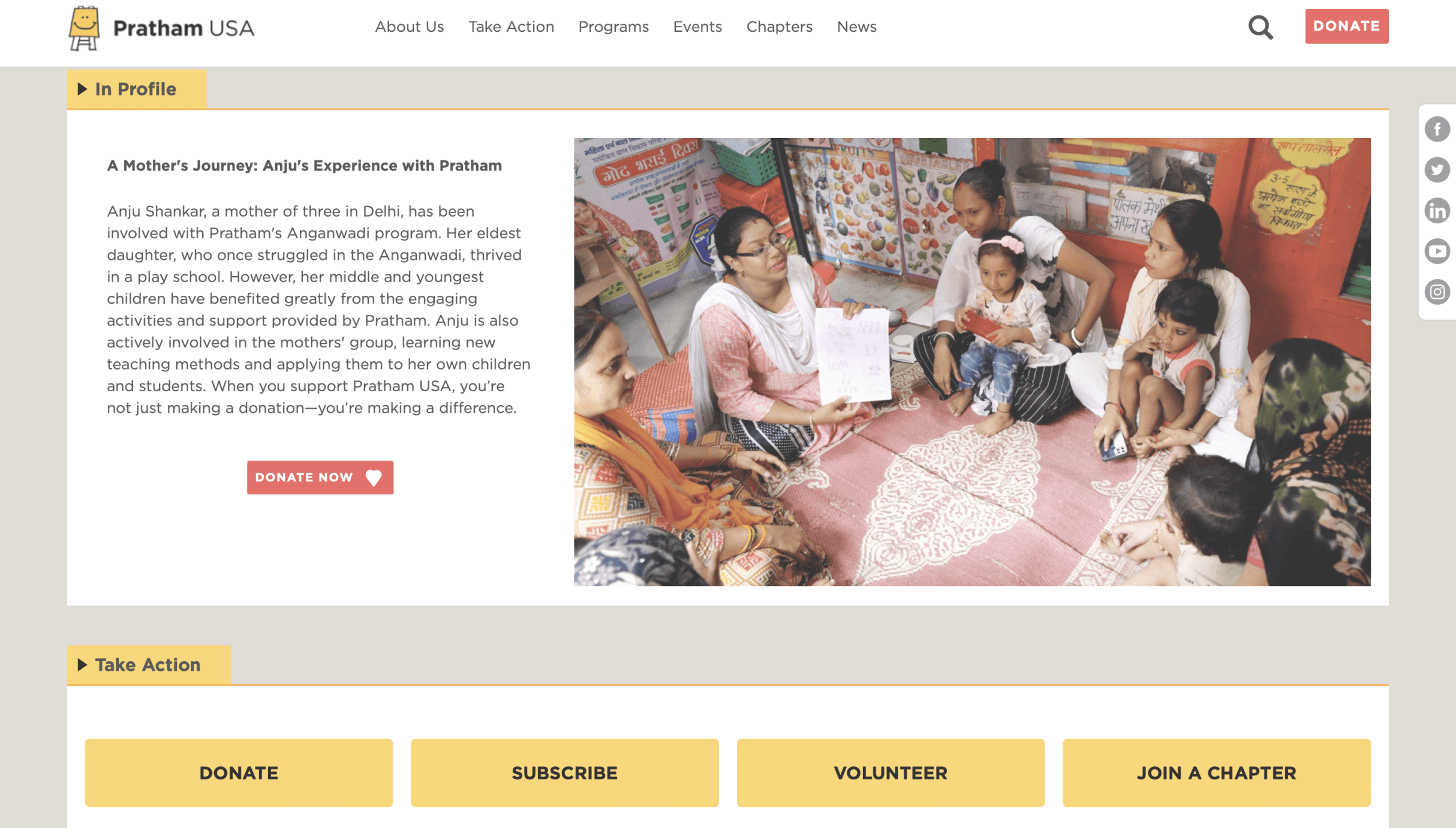
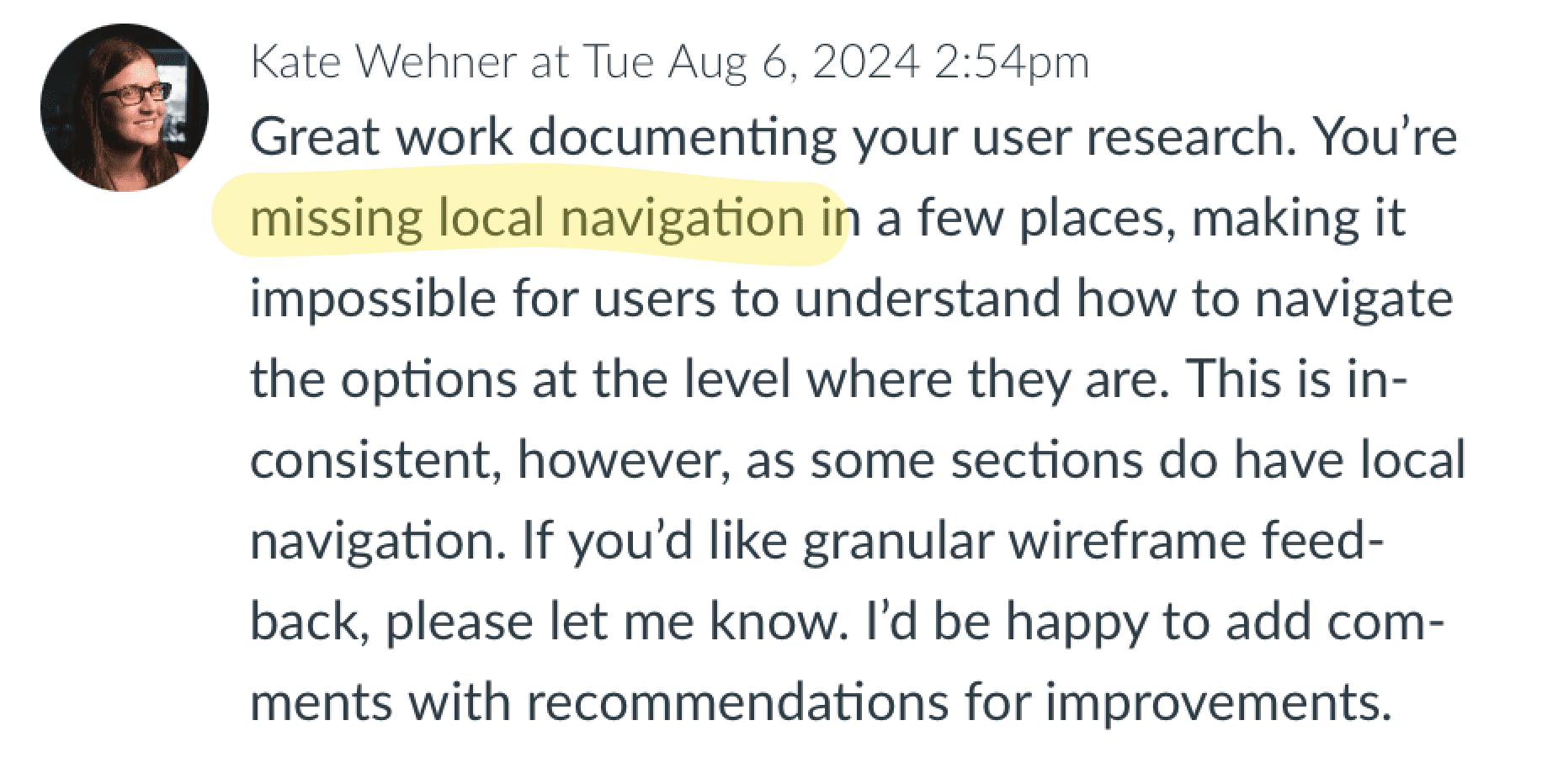
Use of local navigation to tackle deep navigation
Adding breadcrumbs and creating local navigation helped create a clear path through the user journey.
PROTOTYPING
REFLECTION
There’s more room to grow
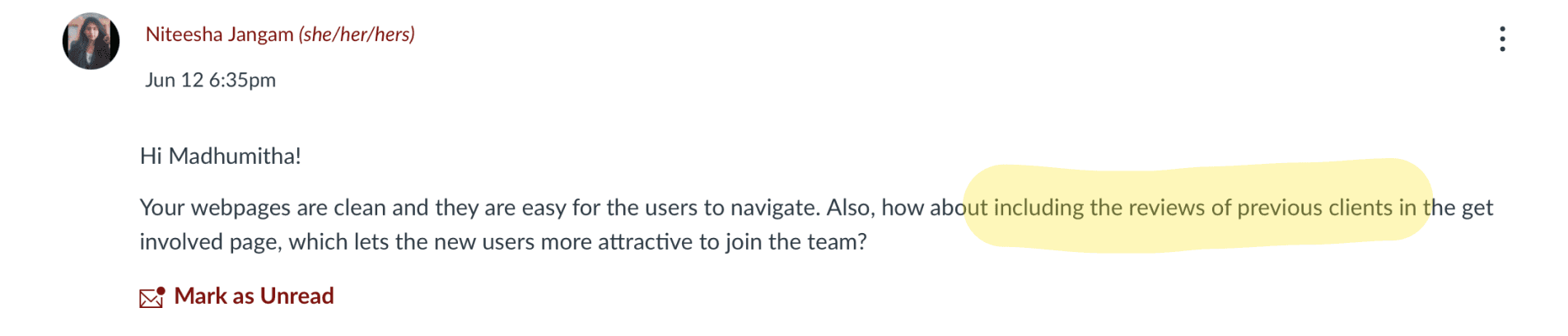
Based on my professor’s comments and my classmate’s comments
I’ll make the website consistent with local navigation
Include testimonials to increase the user’s trust
High Fidelity Prototypes
Looking back, I wish I would have been able to incorporate high fidelity prototypes into the project. Unfortunately, the scope of the project and the time constraint of the deliverables did not allow the space for high fidelity prototypes.
Other works
Seeing the unseen using AI
app.whiteboard.microsoft.com
Cobb, Jessica
Cobb, Jessica
Co-pilot
Notes
Prognosis Report
The patient is a 58-year-old male with a history of type 2 diabetes and hypertension. He presented with chest pain and was diagnosed with a non-ST elevation myocardial infarction (NSTEMI). A stent was placed successfully. Given his stable vitals post-procedure and absence of complications, the prognosis is favorable. He is expected to recover well with adherence to medication, diet, and cardiac
EHR Consistency Check
Co-Pilot Control
Risk Factor Scan
Additional checkpoints
Comorbidities
Accounted for diabetes and hypertension in recovery outlook?
Long-Term Risks
Considered heart failure or recurrent MI?
Rehab Impact
Rehab compliance flagged as a recovery risk?
BMI Factor
Have you considered how the patient’s weight (BMI 32) might influence recovery?
Adherence History
Is “expected to recover well” supported by this patient’s past adherence in the EHR?
Create Note
Ambient 1
Prog 2
Prog 3
My Note
ED Provider Name - 4/22/2025 11:25AM
ROS
History of Present Illness
Review of Systems
Objective
Physical exam
Response to interventions

www.iaspire.accenture.com
About
My Squad
My Missions
League Board
Winners
Explore all the actions you and your squad can take to enhance your squad’s strategy
Weekly Bonus Cards
Submit your idea for the iAspire feature of the future
WEEKLY QUEST
300
All members of the league have saved their industry Aspiration
WEEKLY QUEST
300
Take action
All members of the league have saved their industry
Coming soon
300
Career Actions To Accomplish
Here all the actions you can take over the course of the league to help you and your squad to get ahead!
Define your career path and set and update your aspiration
Take action

90
Add an industry and delivery skill
Take action
80
Add professional learning on the career path page
Take action
30
www.iaspire.accenture.com
My Projects (8)
Select the projects to view the people details and team analysis respectively
Reset
Dove
|
Unilever
39 People
BMS
|
Unilever
24 People
BPP
|
Verizon
20 People
IOM
|
Verizon
19 People
Levels
All
SE
SSE
TL
AM
Roles
7 roles | 26 people based on selected levels
15
Application/Cloud Support
12
Packaged Application Developement
11
Packaged Application Developement
08
Application/Cloud Support
07
Application/Cloud Support
06
Application/Cloud Support
05
Application/Cloud Support
Skills
43 skills based on selected levels
IT Financial Management
Information Communication
Technology(ICT)
Microsoft Azure Architecture
Microsoft Azure Devops
Microsoft Azure Iaas
Microsoft Azure Paas
Microsoft Azure Paas
2
4
6
8
10
Number of people
No Proficiency
P1
P2
P3
P4
P5
Let’s chat
Always happy to connect, brainstorm, or dive into
something creative together.
This website is best viewed on desktop
Madhumitha Manimaran © 2023.
